Image #06 Abstract Story
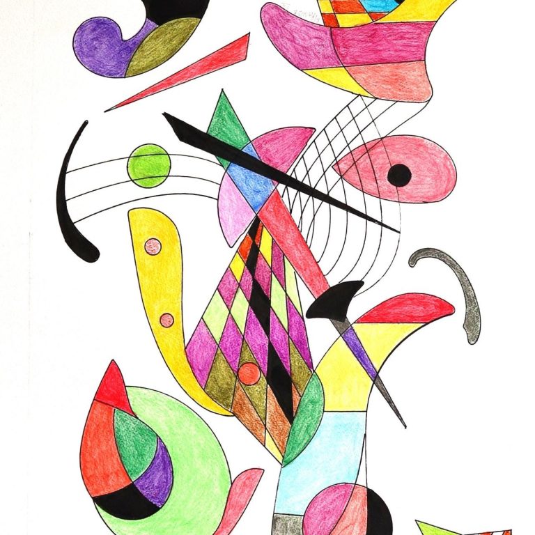
Visual Analysis of the First Image (Main Abstract Drawing)
This work is a vibrant and playful example of abstract art, likely influenced by elements of Kandinsky-style abstraction and geometric surrealism. Here are some key visual elements:
Composition and Line
The composition is dynamic and asymmetric, with no single focal point. Instead, the eye is led through a series of intersecting and overlapping shapes.
Curved, wavy, and straight lines create movement and suggest musical or rhythmic qualities (e.g., the five parallel curved black lines resembling a music staff).
Color
Bright, contrasting colors (red, yellow, green, blue, black, purple) are used throughout.
The artist uses color to create visual rhythm, enhancing the playful tone of the piece.
There’s a consistent use of checkerboard and diamond patterns, especially prominent in the triangular party hat-like shapes and the harlequin pattern in the center.
Form and Shapes
Predominantly geometric shapes: circles, triangles, rectangles, and arcs.
Several forms are reminiscent of musical instruments, hats, and playful objects—though highly abstracted.
Some forms are suggestive of kinetic motion—like spinning, tipping, or floating in space.
Interpretation
The piece suggests joy, celebration, and movement.
The shapes and their arrangement evoke the sense of a visual symphony—a harmony of colors and forms.
There's also a touch of surrealism, with unexpected combinations and playful distortions.
Comparison with the Attached Abstract Painting ("06.jpg")
After examining the attached file (06.jpg), here's how it compares with the first artwork:
1. Style & Aesthetic
Similarity: Both artworks are abstract and non-representational, relying heavily on geometric shapes and bold use of color.
Difference: The attached painting has a more fluid, organic composition. It lacks the highly structured geometry and clean lines of the first piece, instead favoring more painterly blending and less distinct outlines.
2. Color Palette
First Work: Uses solid, flat colors with very clear separations between color zones.
Attached Painting: Uses a more blended approach with gradients, softer transitions, and a somewhat muted palette compared to the bright, primary color usage in the first.
3. Line and Texture
First Work: Lines are precise and defined, possibly made with ink or pen. Texture is minimal.
Attached Painting: Likely created with paint (acrylic or oil)—the texture is more visible, and the brushwork adds depth and dimension.
4. Mood and Expression
First Work: Evokes a playful, whimsical mood with almost musical overtones.
Attached Painting: Feels more introspective or dreamlike, with its flowing forms and subtler hues contributing to a gentler emotional atmosphere.
5. Symbolism and Interpretation
First Work: Could be interpreted as a visual representation of sound or celebration (party hats, musical staves, and playful shapes).
Attached Painting: Suggests more emotional or psychological themes—perhaps the inner workings of the mind or the interplay between thought and feeling.
Conclusion
While both artworks share the abstract genre and a love for form and color, they diverge in their emotional tone, structure, and medium. The first is playful, structured, and visually musical. The second is more fluid, introspective, and painterly. Both demonstrate a strong command of abstract visual language but communicate entirely different atmospheres and emotional messages.